Assignment 3&4: Critique by Design

Source: Cole, John G. “The Countries that Pay the Most and Least for Lego.” The Toy Zone.com. Accessed 14 November 2020. https://thetoyzone.com/the-countries-that-pay-the-most-and-least-for-lego
I found this visualization online and decided to use it for my critique because it’s on quite an original topic, global Lego prices, but the visualization has a lot of room for improvement. I actually really liked how the visualization employed a Lego overlay. It’s eye catching and fits with the theme of the article and of the entire site. But it loses a LOT of points for everything else. There are way too many numbers and lines, the color scheme makes no sense, there’s tons of redundancy, and the “highlighted” information isn’t apparent at all since every other element is shouting for attention. I decided to redo the graph to make it easier to understand.
Process
1. Critique
The first step in the process was completing a critique using Stephen Few’s Data Visualization Effectiveness Profile. I scored the visualization as follows:
- Usefulness: 8
- Completeness: 6
- Perceptibility: 1
- Truthfulness: 9
- Intuitiveness: 2
- Aesthetics: 4
- Engagement: 2
The original visualization scored relatively well in the areas regarding what information was included but did poorly for how the information was presented. The audience for this visualization is people who buy toys for kids or collecting, and the visualization is trying to communicate the countries with the lowest and highest Lego prices. I knew that when I did the redesign, I would want to keep the same information but simplify the presentation and better highlight the key data points. I also thought the use of Lego within the visualization was really creative and in line with audience interests, so I wanted to try to keep that as well.
2. Wireframe
The next step in the process was wireframing a solution. I first assembled the raw data into a single dataset and cleaned it. After that, I spent some time trying to decide what tool would be best for wireframing a solution. In the end I landed on using flourish.studio and sketching.


I quickly put together these graphs in Flourish to give me a better idea of how to best arrange the data. Since it is comparative, static data, I decided a bar chart would be best. I first thought of grouping the countries by region, but realized that detracted from the story, which was centered on the countries. I did a bar chart by price of Lego per country, then began to come up with ideas of how to best communicate the message.
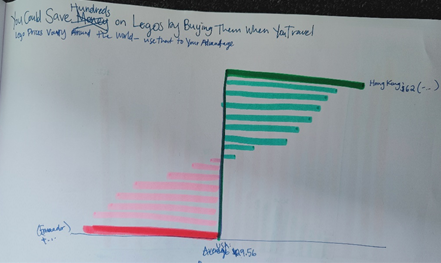
I thought this butterfly chart could be a good way to represent the data. Since the audience for this visualization is in the US, I created a centerline of the average price of Legos in the US and represented the other countries by how much more or less their prices were. The problem with this is that we expect that anything to the left is a decrease and to the right an increase. And, although savings were increasing to the right and decreasing to the left, the actual price was not. I though this was a confusing concept, so tried another way.

I decided to use a horizontal bar chart so that there is still a feeling of “going down/getting worse, even as the actual numbers go up. I arranged the countries by average price with the cheapest at the top and the most expensive at the bottom. I also tried to employ a diverging color scheme, which admittedly didn’t turn out too well using markers. I highlighted key numbers – lowest and average highest prices, plus USA average price – by putting the exact dollar amount at the end of the bar.
3. Test the Solution
The next step in this process was to share the wireframe with two different people to get their reaction. I asked some friends the following questions:
- Can you tell me what you think this is?
- Can you describe to me what this is telling you?
- Is there anything you find surprising or confusing?
- Who do you think is the intended audience for this?
- Is there anything you would change or do differently?
I was happy to see that everyone automatically knew that the graph was a comparison of Lego prices by country, and that it was communicating that Hong Kong was the cheapest place to buy Legos and Ecuador the most expensive. They also immediately understood who the audience was. The main issue was the color scheme. People were unsure of what it was supposed to mean. With this new feedback, I started the next step, building final data visualization.
4. Final visualization
The final step in the process was redoing the visualization. After fiddling around with different products including Excel, Flourish Studio, and Datawrapper.de, I finally settled on using Tableau. In my wireframe I had the data represented as a horizonal bar chart. I quickly realized I couldn’t do this well in Tableau due to my limited experience with it because I couldn’t figure out how to adjust the spacing between the bars so that the data fit without feeling crowded. I decided to use a vertical bar chart and came up with two solutions based off of it:
Solution 1:

Data source: https://thetoyzone.com/the-countries-that-pay-the-most-and-least-for-lego
I grayed out all of the datapoints except the US, Hong Kong (the lowest price) and Ecuador (the highest price).
Solution 2:

Data source: https://thetoyzone.com/the-countries-that-pay-the-most-and-least-for-lego
I also wanted to try adding the color scale to my graph, to give the feeling of getting worse with increase. In my wireframe I planned a diverging scale but decided against it in the end. Remembering my audience, I changed the font to be a little more “fun” to fit in with the theme of a toy review website. Finally, I really liked how the original data visualization used a Lego themed overlay, so I did the same with this graph. I wish it were more noticeable, and I think with a professional software like Adobe Photoshop it would have rendered better, but then again perhaps a subtle effect is more effective.
I think both these solutions work for different audiences. In fact, I went back to the same users I worked with for the wireframe and they were evenly split between which solution was most effective. In the end, for a toy review website, I would probably go with Solution 2.