Project: Mapping the British Museum

Animation of imperial Britain’s spread compared to collection of objects for the British Museum, in ten year intervals

Dashboard to explore objects. For more information on this, see Approach, Methodology, and Analysis: Step 7
Background
The British Museum has long been a source of controversy. It is an encyclopedic museum whose mission is “to hold for the benefit and education of humanity a collection representative of world cultures (‘the collection’), and ensure that the collection is housed in safety, conserved, curated, researched and exhibited” (britishmuseum.org). However, many of the objects in the collection are either suspected or confirmed to have been looted from countries that imperial Britain colonized. Well known examples are the Parthenon Marbles, the Rosetta Stone, and the Benin Bronzes, though there are many other objects in the museum’s eight million object collection that are of dubious provenance. The purpose of this project was to create a tool to act as a visual aid to shed light on the nature of the museum’s collection. The tool includes interactive elements and quantified visuals that communicate the magnitude of the issue to the public. Additionally, with more information on looted objects, these deliverables can be developed further to build a predictive model to assess any object at the British Museum for likelihood that it was looted. Finally, this may be used as a model on how to approach decolonizing other museum collections.
Approach, Methodology, and Analysis
Step 1: Conduct background research and create work plan
For this first task, I researched the history of the British museum, how to download British museum collections information into a dataset, and I located information that could be useful for creating a geospatial data of British invasions and occupations
Step 2: Create a dataset of the British Museum collection
The British Museum has made their collections database publicly available at https://www.britishmuseum.org/collection. The database has been in progress for 40 years and is still not done – there are over 8 million pieces in the museum, and only around half of those have been uploaded to the database so far. Access to only half of the objects in the collection is not a problem for this project since 4 million objects is still a good sized sample, but future work could include updating this project to use all of the items in the collection, once the database is finished.
This task took considerably longer than anticipated, in part because the British Museum took down the public SPARQL endpoint that was used to query their collections database. I was left to manually download the necessary datasets through their online collections website. The biggest frustration with this was that downloads of more than 10,000 pieces are not allowed. I didn’t have time to build a web scraper for this purpose, so I went to the collection online, used the filter feature to filter by region (Africa, Oceania, the America, Asia, Europe) and then, for each region, filtered by preset subject filters for arts/architecture, ceremony/ritual, society/human life and religion/belief. At the end I had over 100 datasets downloaded, which I combined into one dataset using Python. I next cleaned the dataset in Python using the following steps:
-
Removed rows with duplicate values
-
Removed objects that were photographs by removing rows with “Technique” listed as any of the following: Albumen printing, gelatin silver printing, photograph, glyphograph, negative, photograph, postcard. This removed over 100,000 rows.
-
Removed objects listed as coins, which removed 333,000 rows.
-
Filled NaN values with 0
-
Removed unneeded columns (“Image,” “Denomination,” “Escapement,” “Type series,” “Dimensions,” “Inscription,” “Curators comments,” “Bib references,” “BM/Big number,” “Reg number,” “Add ids,” “Cat no,” “Banknote serial number,” “Joined objects,” “Authority,” “Condition,” “School/style,” “State,” “Ethnic Name (made by),” “Ethnic name (assoc),” “Ware,” “Subjects,” “Assoc name,” “Assoc place,” “Assoc events,” “Assoc titles,” “Acq name (excavator),” and “Acq name (previous).”
The cleaned dataset had approximately 857,445 rows (each corresponding to an object) and 10 columns. The columns were:
- Object_type: Type of object (painting, pottery, etc)
- Title: Name of object, if exists
- Description: A brief description of the object
- Culture: The culture from which the object came
- Production date: The confirmed or estimated year the object was made
- Production place: The place the object was made. Recorded either as city, country, POI, or a mix of all three
- Find spot: The place the object was “found.” The place the object was made. Recorded either as city, country, POI, or a mix of all three
- Acq date: The year the object was acquired by the British Museum
- Acq notes (acq): Any notes about the acquisition
- Location: Says whether the object is on display and, if so, where in the museum it is
Step 3: Geocode
The next step in the process was to geocode the objects based in location. The dataset had two location attributes, “Find spot” and “Production place.” The location information has been recorded inconsistently so some objects only have “Find spot,” noted, some only Production place, and some both. To approach this, I decided to geocode by the “Find spot” column first, which is most relevant to the purpose of this project then geocode anything without a “Find spot” by the “Production place” column, since it still reliably approximates the information of interest.
To start, I used Python to concatenate the “Find spot” and “Production place” columns and drop all columns that had a null value in both. That got rid of objects without location information so could not be used for the project. This removed 254,582 objects. The resulting dataset was now 602,863 rows (objects).
Instead of geocoding 600k + objects, I decided to make a list of all the locations in the dataset, with the understanding that many would repeat as multiple objects correspond to the same location, geocode this list, then join the collections dataset to the geocoded locations. To start, I made a list of unique instances in the “Find spot” column and in the “Production place” column and merged them into a single list while concurrently dropping duplicate values. This gave me a list with 9,087 locations. I knew there were locations that repeated since the way locations were entered is so inconsistent - for example, “Iran,” “Iran, East” and “Iran (archaic)” are all read as separate locations. The 9k entries on this list represent an upward bound of the true number of locations for objects. The process needed to geocode exact locations for each object are beyond the scope of this project; instead, I geocoded by city, when available, and country.
I used the Geocode Address tool with Esri’s World Map Locator to geocode the “Find spot” and “Production place” columns in the dataset. I geocoded with parameters set to look in all countries, with categories set to “Populated Places” and “POI.” The results of the first geocode are here:

Figure 1: Locations of British Museum objects geocoded
I noticed a high number of objects from the US (highlighted in blue), which seemed odd to me since the British museum is not known for having a large Indigenous American or North American collection. I highlighted these to explore them further and realized that the list of addresses I built from the database contained archaic place names like Naukratis, Pharae, Cleonae, Thebes, Marathon, and others. The geocoder matched these places to cities in the US with the same names. There were also a number of unmatched rows locations that had not been recognized at all. Using the Rematch Address Tool, I rematched all unmatched addresses. Next, I selected all rows by attribute to find objects that had been matched to the US. I manually went through the list and coded locations correctly.

Figure 2: Mismatched US addresses matched correctly
The results of this rematch (fig. 2) showed that there were still quite a few points in the US, but many mismatched points belonged in the Mediterranean region, because they were place names in ancient empires like the Roman, Greek, and Byzantine empires.
The locator I used was the Esri World Locator, but I had to go through and manually recode addresses that were names of archaic cities. In future, datasets that have a lot of archaic names could be geocoded from a locator created using ancient city names and their modern equivalents. This is an example of such a dataset.
Here is the final map with locations geocoded:

Figure 3: Object locations geocoded
This is a visual representation of where objects in the British collection come from. It’s not surprising that many objects have origins in different places in Britain. It’s interesting to see that India and the Mediterranean region are also highly represented. In Africa, places along the coastline seem to have a high representation in the collection. At first glance, it seems that most object origins were in Britain and India. To be sure, I did a hot spot analysis using the Optimized Hot Spot Tool:


Figures 4 & 5: Hotspot analysis, zoomed to Britain
The hotspot analysis showed that there was a meaningful cluster of locations in and around Britain.
Step 4: Plot objects to as points to layer
The next step was to plot the objects in the collection to the map by joining the rows to their corresponding geocoded locations. I imported the collections CSV into ArcGIS and did some basic exploratory analysis by creating charts from the collections data.

Figure 6: Objects aggregated by object type
The most common object type is “print.”

Figure 7: Objects aggregated by date
There was a peak in acquiring objects around 1818. Collecting picked up in the mid-1800s and remained steady. There are also quite a few number of objects in the collection that do not have the date of acquisition included (57,183 rows with “0” in the acquisition date column).
I then joined the collections data table to the geocoded locations layer. For this, I created a new field called “JoinLoc” that copied data from the “Find spot” column, but if null, would fill with the “Production place” field. I then executed a table join to create the new layer.
I ran another hotspot analysis to see if the results would be different since each point now corresponded to an object, not just a location, but the results were the same – the majority of objects were of British origin (fig. 8).

Figure 8: Hotspot analysis 2
Step 5: Visualize and analyzing collection’s temporal data
I was interested in knowing when the museum collected its pieces from different places. I initially planned to use Tracking Analyst in this stage of the analysis, but Tracking Analyst is not offered with ArcGIS Pro. Instead I used ArcGIS built in temporal capabilities and several analysis tools. To start, I created a new field of dates. I copied “acquisition date.” Those without an acquisition date listed (over 57,000 rows) had a Null value. I then used the Convert Time Field tool to convert from str values to date. I added this column (Date_converted) into the layers properties as Time. This process removed all of the data with Null values for date, leaving 545,670 objects. This added in the dimension of time that I wanted to convey. I selected to display objects by 10 year intervals.
 Figure 9: Animation of all objects in 10 year intervals
These were the initial results (fig.9). Acquisition outside of Britain started early on and continued to increase with time.
I wanted to see the amount of acquisition from each location, so I used the Frequency tool to aggregate the dataset by their coordinates and date.
 Figure 10: Animation of all objects in 10 year intervals, graduated symbology
Aggregating by Frequency of objects (representing number of objects from location) tells a somewhat different story. The amount of objects taken from locations outside of Britain show that a large amount of objects were taken from what appears to be Nigeria, Japan, and India. The region near Britain is also very active.
To get a closer look, I zoomed in on each region:
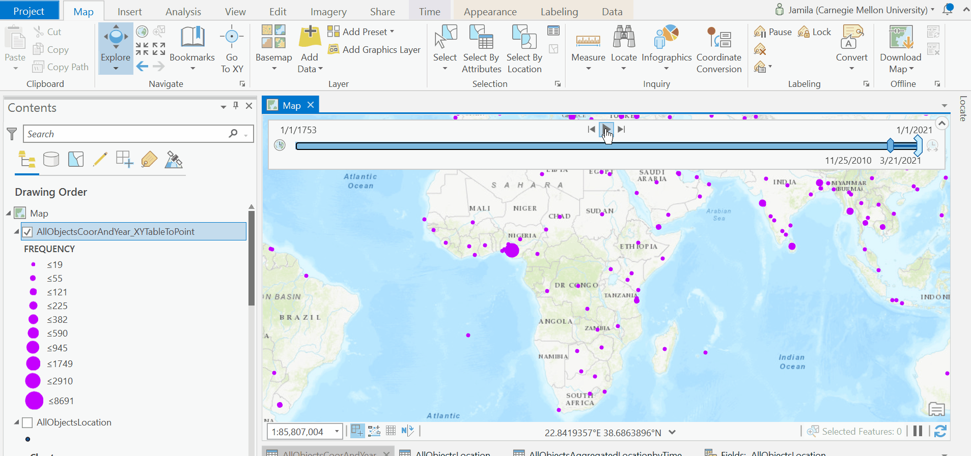 Figure 11: Animation of all objects in 10 year intervals, graduated symbology, in Africa
Many objects in Africa were sourced from Nigeria, Egypt, Zimbabwe, and Malawi.

Figure 12: Animation of all objects in 10 year intervals, graduated symbology, in Asia and the Middle East
In Asia and the Middle East, China, India, Japan, the Levant, and Malaysia are notable.
 Figure 13: Animation of all objects in 10 year intervals, graduated symbology, in Europe
In Europe, Britain, Italy, France, and Germany are notable.
 Figure 14: Animation of all objects in 10 year intervals, graduated symbology, in North America
In North America, it looks like the majority of items were sourced from Mexico and the east coast of the US.
 Figure 15: Animation of all objects in 10 year intervals, graduated symbology, in South America
Comparatively few items came from South America. Those that did came from the Andean region.
 Figure 16: Animation of all objects in 10 year intervals, graduated symbology, Oceania.
Many objects in Oceania were sourced from Australia, and there is an interesting and surprising number of objects sourced from Papua New Guinea.
I then sorted locations by number of objects per year and selected all those that had 1000 objects or more per year, which ended up being 74 place/year combinations.

Figures 17 & 18: Selection from the top 74 source countries and years - table(17) and chart(18)
This table shows the top 15 locations and years. All come from Britain, Nigeria, Italy, and Japan. For top locations across all years (the bar chart), Britain, Japan, and France, Italy, and Nigeria are in the top five.


I re-sorted, this time leaving out Great Britain. This time top countries were Nigeria, Japan, Italy, France, Greece, India, and Korea. For top locations for all years (the bar chart), Japan, France, Italy, Nigeria, and Switzerland are the top five.
Step 6: Create a layer using the colonial time period dataset (COLDAT) and visualize temporal data
I was interested in comparing these dates to the dates of British colonization. To do that, I started by creating a layer using country boundary shapefiles and the COLDAT dataset, which was created by academics to track the duration of colonial European empires. I then added the time field and set it to step every 10 years. At this point, for fun, I updated the base map to Modern Antique, which I downloaded from Living Atlas. I also downloaded the Physical Geography symbology set and the Firefly Geography set from Esri Styles to use in the map.
This was the result:
 Figure 21: Animation of colonial Britain, from 1600 to present
The final step was to overlay the layer showing the objects by time to see if there was any overlap.
 Figure 22: Animation of colonial Britain compared to acquisition of objects for the British Museum
The green “sparks” represent objects taken from each country. There is a lag between 1607, which marks the start of Britain’s colonization, and 1759, which is when the British Museum opened. The results of this were insidious. There is a clear correlation between time of colonization and acquisition of objects, particularly in India and countries in Africa and Oceania.
I completed my work in ArcGIS Pro with a final, static map, visualized with each object as a single point, for the entire timespan of the British Museum collection. The objects overlay the map of British colonies throughout the entire span of the empire.

Figure 23: Final map layout
Step 7: Create and publish an embeddable, interactive dashboard of findings in ArcGIS Dashboards
Something else that I wanted to look at was what objects the British Museum was sourcing from each location each year. To explore this more, I decided to create a dashboard with ArcGIS Dashboards to allow for further exploration of the data. I planned to publish this so others could interact with the data, too.
To start, I uploaded my completed map to ArcGIS online as a web map. I then created a new dashboard and inserted the map and a tool to sort through object locations by country name and year. I included two interesting charts on the dashboard.
This is a screenshot of the final dashboard (also embedded at the top of the page) with a link to the final dashboard

The first chart I included in the dashboard visualized object type and frequency in the database as a scrollable bar chart.

Figure 24: Screenshot: Dashboard chart - frequency of object type
As it turns out, a little over 19 thousand objects are bank notes.
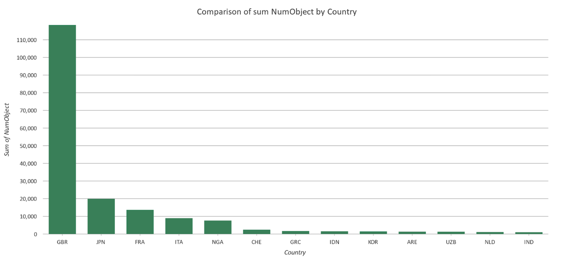
The other chart displayed top countries that objects came from each year, not including Britain.

Figure 25: Screenshot: Dashboard chart - frequency of object type
This shows that 6 thousand objects came from Nigeria in 2008. I investigated this in the data and found that most of these objects were photo negatives.
The dashbord gives the option to filter for country and year allows users to examine the data more closely.

Figure 26: Screenshot: Final dashboard - zoomed to Egypt
Here we can see that the items sourced from Egypt came from areas along the Nile. The dark background indicates that Egypt was indeed a British colony.
By clicking on any of the points, users are given more information about the objects taken from there. For example:

Figure 27: Screenshot: Final dashboard - zoomed to Egypt, detail
At this point there were five objects taken. This one was acquired by the British Museum in 1895, is listed as a “tray,” and we are given a description of it.
This is a process flow that users can follow to explore objects in the context of where and when they were acquired by the British Museum.
Findings and Future Work
Findings:
The guiding concept behind this project was to visualize the acquisition of objects from around the world for the British Museum collection and compare that to imperial Britain’s presence in the countries of origin. The analysis detailed in this report shows that correlation does exist. It is obvious that colonial Britain was indeed taking objects from places during periods of colonization. Even though the British Museum claims that many of these items were not wrongfully taken, saying “they were not acquired as a result of conflict or violence,” the power imbalance between colonizers and colonized implies lack of full willingness and compliance, unless the British Museum can prove otherwise. Having this visualized and shareable is a powerful storytelling tool. As somewhat of a side note, another interesting finding from this analysis is that many objects in the British Museum are photographs, printed material, and banknotes. While their claim of having 8 million objects is certainly valid, knowledge of what these are helps contextualize the statement.
Future work:
One of the limitations of this project was that only half of the objects in the museum have been recorded in their database. This analysis could be relaunched in future to include those objects once they are updated to the database. Something notable in this project which is probably related to that is the exclusion of 57,000 objects from the temporal analysis due to not having an acquisition date recorded. It could be interesting to look into these objects further to see if a pattern exists in objects that are in the database with no acquisition date attached.
Data Sources & References
Data Sources:
- The British Museum Collection
- COLDAT colonial dataset
- Map Layers and Symbology:
References:
-
“About Us.” British Museum. Accessed 27 Apr, 2021. https://www.britishmuseum.org/privacy-policy#:~:text=The%20British%20Museum%20was%20founded,%2C%20curated%2C%20researched%20and%20exhibited
-
Alberge, Dalya. “British Museum is world’s largest receiver of stolen goods, says QC.” the Guardian.com. 4 Nov 2019. https://www.theguardian.com/world/2019/nov/04/british-museum-is-worlds-largest-receiver-of-stolen-goods-says-qc
-
Landolfi, Jessica. “Even After 130 Years, National Geographic Captures a Wide Demographic Across all Mediums.” CiviScience.com. 12 Aug 2020. https://civicscience.com/even-after-130-years-national-geographic-captures-a-wide-demographic-across-all-mediums/#:~:text=Demographically%2C%20Watchers%20and%20Readers%20are%20Different&text=Specifically%2C%20U.S.%20Adults%20ages%2055,the%20magazine%20is%20the%20opposite.